

Psychology of Colour in Branding and Marketing

Understanding the Psychology of Colour and 6 Top Tips
The Role of Colour
Colour plays a fundamental role in branding, marketing and consumer psychology. It helps brands stand out, communicate personality and create emotional connections with customers. From logos and packaging to websites and advertising, the right colour palette can strengthen brand recognition, influence purchasing decisions and improve long-term brand recall.
Research in colour psychology suggests that colours evoke emotional and behavioural responses, often before consumers have consciously processed a brand’s message. As a result, choosing the right brand colours is far more than an aesthetic decision—it is a strategic branding choice that shapes how people perceive and remember your business.
Colour Psychology and Brand Identity
One of the primary goals of branding is to create a distinctive brand identity that customers immediately recognise and understand. The strongest brands communicate who they are instantly, often without relying on words.
A useful starting point is identifying your brand archetype, one of the twelve universal personality types popularised by Carl Jung. Brand archetypes provide a clear framework for defining your brand’s character, tone of voice and visual identity, helping create a more consistent and memorable customer experience. If you haven’t yet identified your archetype, try our Brand Archetype Quiz to discover which personality best reflects your brand.
Once you’ve established your brand personality, colour becomes one of the most powerful tools for bringing it to life.
Brand Colour Wheel
To help you choose the right colours, below is a summary from various studies summarising people’s reactions and thoughts on colours in the UK and many (but not all) international markets:
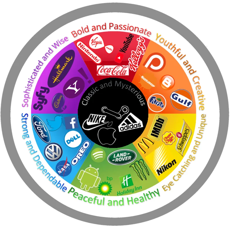
For the most effective colour choice, you must consider what your brand personality is trying to convey. For instance, if your brand sells children’s toys, using dark colours would make it appear more stylish and mysterious rather than youthful and happy and is unlikely to convey the right vibe or values. Likewise, cooler-toned or muted colours often denote calmness and reliability; hence, they are used in many hospitals and B2B companies.
Best Practice for Choosing Brand Colours
When developing your brand colour palette, consider the following:
- Choose colours that reflect your brand personality and archetype.
- Ensure colours differentiate your brand from competitors.
- Use colour consistently across your logo, website, packaging and marketing materials.
- Consider cultural differences, as colour meanings can vary internationally.
- Test colours with your target audience to understand the emotions and associations they create.
- Remember that accessibility matters—ensure sufficient colour contrast for readability and inclusivity.
Colour is More Than Design
But remember, colour alone is not enough to develop strong branding.
While colour alone won’t create a successful brand, it is one of the most powerful visual assets available to marketers. When aligned with a clear brand strategy, consistent messaging and a distinctive personality, colour helps increase brand recognition, strengthen emotional connections and improve long-term brand equity.
The meaning behind the 8 primary colours:
Red – Passionate, Power, Bold
Red has been shown to increase heart rate, stimulate appetite and create urgency, so it’s particularly useful in clearance sales. No matter what emotion it evokes, it will be strong and passionate. Because it’s used by the government and its branches (such as the postal service), it’s not surprising that red is often seen as powerful and imposing.
Orange – Creativity, Spontaneity, Humour
Because Orange is a mixture of Red and Yellow, it naturally has attributes of both. While it is still bold and can create a sense of urgency like Red, it has the youthfulness and playfulness of Yellow. Orange can bring fun and humour into a brand without being overtly childish.
Yellow – Youthfulness, cheerfulness, uniqueness
Has been shown to stimulate both mental processes and the nervous system. Yellow is happiness and optimism poured into a single colour, and so is often used when marketing towards children. It is also often used to encourage communication and promote clarity. Because of how visible the colour is, it is usually found in store windows or on road signs.
Green – Environment, Peaceful, Healthiness
Green is often used to relax customers in stores. Like Blue and Brown, Green is a naturally occurring colour and can be seen throughout nature, and so in turn, is viewed as a calming colour. It tends to symbolise many things, from health to money, and, interestingly, the human eye can distinguish more shades of green than any other colour.
Blue – Tranquil, Strong, Dependable
Blue, most likely because of its ties to the sea and sky, has long been considered the most calming and serene colour. It is a colour of quiet confidence because of the feelings of strength and dependability it exudes. Because of these qualities, it is widely used by companies and found in office blocks.
Purple – Royalty, Sophistication, Enlightened
Purple, being a combination of Red and blue, naturally draws on attributes from both, resulting in what is widely considered a sensual and even spiritual colour. Purple is also highly imaginative and can spark new ideas- often deep and philosophical ideas at that.
Brown – Earth, Honesty, Humbleness
Brown is the most common in nature. It is a humble and understated colour that can easily be correlated with hard work and manual labour, and so while not exactly sophisticated, Brown can very rarely be viewed with suspicion. Alternatively, Brown can be seen in a different light from food and drink companies, as the colour is often associated with chocolate and coffee.
Black – Sleekness, Mysterious, Class
While it can be seen as a serious, rather stoic colour, Black, when used correctly, can convey an aura of independence and sophistication. While most often used in contrast with other colours for effect or legibility in writing, mostly black packaging, web design, etc., can make the product feel sleek and luxurious. Due to its ties with darkness and general morbidity, black should be used appropriately and will prove infinitely more effective in some markets than others
Why Owning a Colour Matters
Brands that successfully establish ownership of a distinctive colour or colour combination gain a significant competitive advantage. Over time, colours become powerful memory cues that trigger instant brand recognition, even without a logo or brand name.
Perhaps the best-known example is Coca-Cola and its iconic use of red. Although the popular story that Coca-Cola persuaded Santa Claus to swap his green suit for red is a myth, the fact that so many people believe it demonstrates just how closely the brand has become associated with its signature colour. Today, Coca-Cola’s consistent use of red across packaging, advertising and sponsorship has made it one of the world’s most recognisable visual identities.
Other famous examples include:
- Tiffany & Co.’s distinctive robin’s egg blue
- Lloyds green
- Cadbury’s rich purple
- UPS’s brown
- Barbie’s vibrant pink
- Virgin red
- Caterpillar mustard yellow
These brands demonstrate how consistent colour usage can become a valuable brand asset in its own right.
Understanding the psychology of colour brands in the long-term
Over a prolonged period, colours can become inextricably linked with any brand (assuming no other brand has already taken ownership of that colour. For this to be possible, a consistent colour palette that reflects the brand’s archetype and values is essential. When testing your brand equity, we recommend testing your logo and colour palette as used in our market-leading BrandVision brand-tracking tool.
In short, it is possible to rewire the public’s thought process through good colour choice alone, which is an important part of building your brand’s personality. If you need help, then call us today. For further reading, visit Adobe’s Guide to Colour Meaning.
Latest News
Keep up to date with the latest news from Vision One


