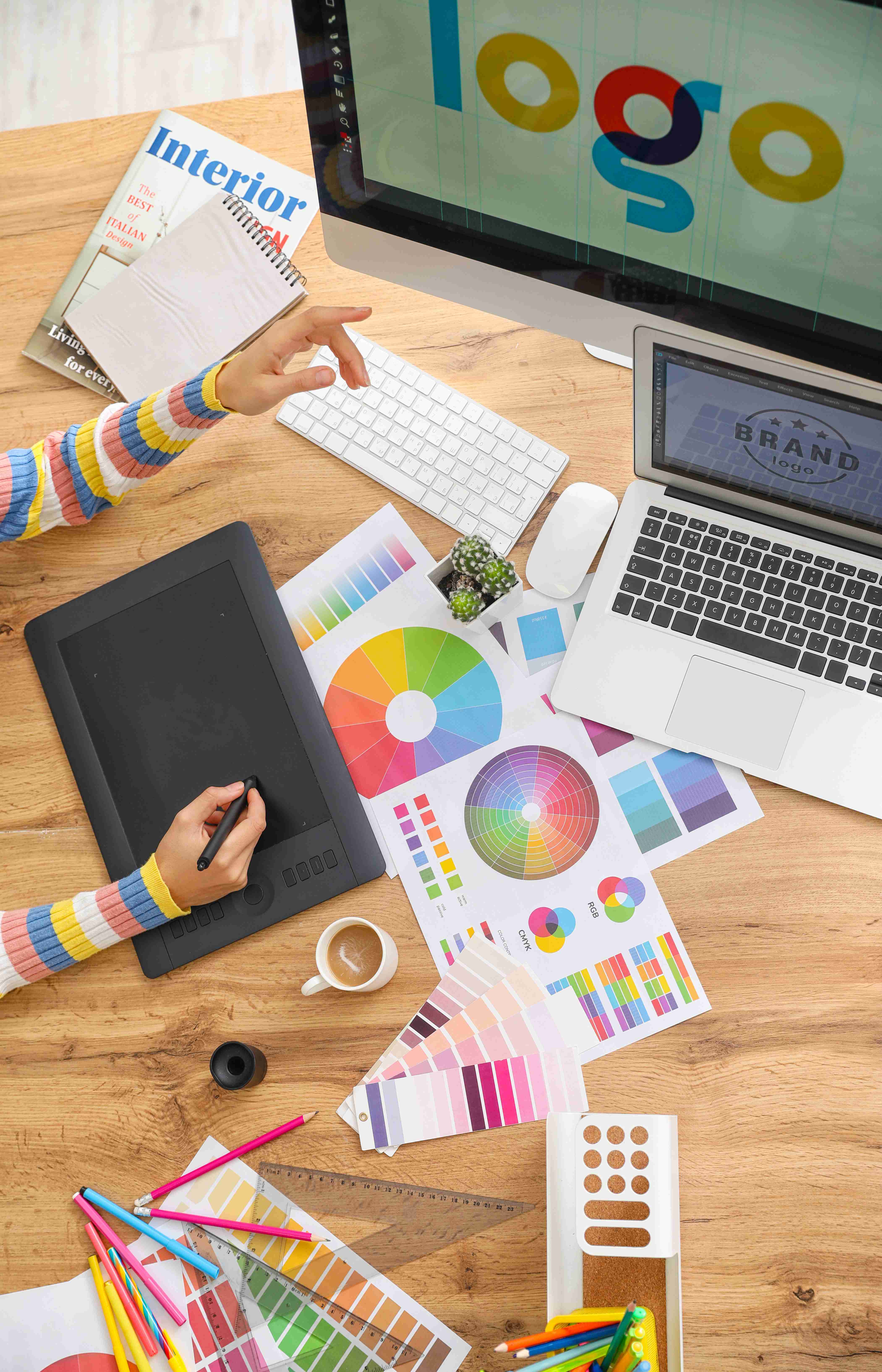
Visual Design: Stand Out Without Losing the Brand
Your visual packaging design includes colour palettes, typography, photography or illustration, layout, and iconography. These elements work together to catch the eye and guide consumer interpretation.
-
Colour is one of the first things consumers notice. Choosing colours that break with category norms can be powerful—but they must also be meaningful and on-brand.
-
Typography and readability matter. Consumers must be able to instantly grasp your product name, variety, and key benefits—even from a distance or on a mobile screen.
-
Iconography and visual claims (e.g. “plant-based”, “low sugar”, “100% recyclable”) help communicate value and differentiation fast.
But visual standout should never come at the expense of brand consistency. Successful packaging connects emotionally while reinforcing your broader brand story.
Role of Research in Packaging Research
Something really helpful to understand what is best for your product is if you do a bit of research into your packaging, receiving insight into what your target audience is thinking about the packaging of your product, with the use of things like heatmaps to see where the focal point of the pack is, and competitor comparisons will go a long way for you to producing your product the best starting position in the market.
We’ve helped countless brands understand strengths and weaknesses both in their own product and their competitors, building on these stepping stones to develop a relationship and a plan of action for the brand as to how they can maximise their ROI.

