The Colour Psychology of Meat Free Brands
Have you ever thought about why brands choose their colours? Or the effect they have on you when deciding between products?…
Market Research News
Have you ever thought about why brands choose their colours? Or the effect they have on you when deciding between products? We’ve taken a look into the Meat Free market to highlight not only what colours brands use, but why they choose the colours they use.
A brand’s colour is intrinsically linked to the ability of a company to create a strong identity with its customers. Brands desire to be distinctive and recognisable because it gives their company better brand awareness.
Awareness is linked to when a consumer is buying a product – they subconsciously recognise brands they are familiar with, whether through usage or advertisements they have seen. So, if consumer awareness isn’t the problem, what is driving their decision? The look of the product.

So why does colour matter?
Colour plays an integral part in the look of a product, which is why across all markets you will find examples of brands trying to stand out from the crowd. So much so that there are brands you can recognise purely from seeing their colour palette. So how does the Meat Free market attempt to add colour to their brands? Well, most of the brands fall into the following:
Orange
Cheerful/Confidence/Creative

Because Orange is a mixture of Red and Yellow, it naturally has attributes of both. While it is still bold and can create a sense of urgency like red, it has the youthfulness and playfulness of yellow. Orange can bring fun and humour into a brand without being overly childish.

It’s fair to say that if you watch some of the advertising from Quorn and The Vegetarian Butcher, the brands fit this description. They both can bring humour into their marketing – a tactic designed to attract attention and stand out from the rest. Quorn may have the largest market share, and The Vegetarian Butcher adopting this approach could be a recipe for success. Because Orange is a mixture of Red and Yellow, it naturally has attributes of both. While it is still bold and can create a sense of urgency like red, it has the youthfulness and playfulness of yellow. Orange can bring fun and humour into a brand without being overly childish.
Green
Green Health/Growth/Peaceful

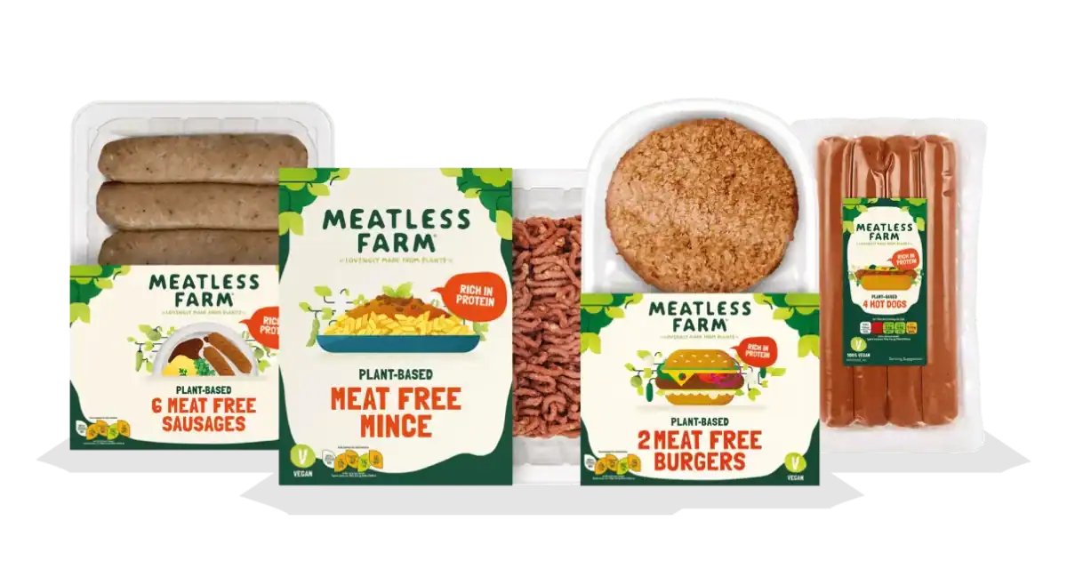
Green is often used to relax customers in stores. Green is a naturally occurring colour and can be seen throughout nature and so in turn, is viewed as a calming colour. It tends to symbolise a lot of things from health to money.
When you hear the description of the colour and how we perceive it, it’s no surprise to see most of the Meat Free brands utilise the colour green. Many view the Meat Free market as an effective way to eradicate the issues we face in the food industry, from an ethical and environmental standpoint, in addition to promoting a healthier lifestyle.

Red
Bold/Youthful

Because Orange is a mixture of Red and Yellow, it naturally has attributes of both. While it is still bold and can create a sense of urgency like red, it has the youthfulness and playfulness of yellow. Orange can bring fun and humour into a brand without being overly childish.

By provoking passionate emotions, brands who want to be bold and out there include red within their branding. Vivera is a brand encouraging consumers to be bold with the flavours they use, and its choice of bright red is the perfect reflection of this.
When brands use colours correctly
They use stark, complementary colours that elevate one another and compliment
They draw your attention and focus to the brightest elements
More energetic brands use brighter colours, those who are more relaxing or more serious go for a darker palette
So thinking about colour – your brand’s logo and colour palette are so important because the emotional brain uses colours, shapes and patterns to help make snap judgements (heuristics) which shape whether we recognise or like a particular brand or object or person.
Contact Us
We are quick, responsive, and above all, our research is customised precisely to your needs, ensuring you get exactly what you need every time.
Email us at mail@visionone.co.uk
Complete the enquiry form.
Or book a meeting below.
Powering Business Decisions


